Between Boredom & Exhaustion I


319 kr
Paper type: Hahnemühle Matte Art Paper
Papir thickness: 210 g/m2
The artwork has been reviewed and printed in Kræss Print Studio in collaboration with the artist. We ensure that the print quality, colors and paper are of the best possible quality, and that the artist is paid for each and every artwork sold. In this way, we ensure creativity and quality for both artist and customer.
Stock status
Webshop: The poster is in stock.
Store: Order online with Click & Collect. Your order is ready for collection no later than 24 hours after ordering.
Most of our posters are always in the store, but we try to minimize our stock and print on-demand for the sake of the environment. We cannot guarantee that the poster will be in the store if you do not order it in advance.
Returning and gift politics
30 days return: You can return the posters in the store or online. You get your money back. If you choose to get the poster framed, you can also return the frame.
If it is a gift: In the basket, you can choose to attach a return label (and gift wrap) if you wish.
All gifts can be exchanged within 30 days. We exchange both in the store and online. If you choose to have the posters framed, the recipient can also change the frame.

Alle vores rammer i er god kvalitet og med ægte glas.
We have chosen for our frames to be cheap because we want you to be able to hang your poster in your home as soon as you receive it.

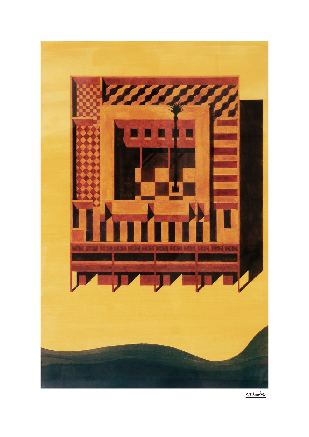
The drawing is part of a bigger research on the architect C.F. Hansen. The aim of the project was to create a dialogue between C.F Hansen’s work, an architect operating in the latter half of the 18th/19th century, and our work as architectural practitioners at the beginning of the 21st century. We wanted to expose and study the abstract quality we perceive in C.F Hansen’s work. His drawings (and consequently his buildings) refuse to impose any overwhelming atmospheric sensation on the viewer, and at the same time, he appears somehow content with this limitation. With rigorous consistency, C.F. Hansen implemented the same language of representation throughout his whole career (pencil/ink drawing rendered in watercolor/ink). The drawings are stripped of labels, people, and window frames. In this way, he reduced his buildings to their purely plastic capacities. The sun is the only participant, providing color and depth to the scene. The reintroduction of C.F Hansen in the format of a drawn reinterpretation is a suggestion to speed down and evaluate change within a broader historical context. The project’s title, “Between Boredom & Exhaustion,” is to be understood within this framework – as a drawn dialogue between his time and our time. The drawings are monochrome, only using one type of water-based ink/tusch, this being the color Paynes Grey. The color was chosen as the color that most accurately conveyed the mood in the original drawings by C.F. Hansen. All the drawings are painted on Clairefontaine Paint On Naturel 594 mm x 420 mm – the paper that matches the original drawings most accurately.
Studio C.S. Lunde is an architecture practice based in Copenhagen. The drawings sold at Kræss are typically drawings that are part of a broader research, or sketch/presentation drawings of a potentially built project.
232783